In particle or high energy physics (HEP), by the time you draw a plot the data are almost always already binned. A long stretch of the analysis pipeline — Uproot, Coffea, boost-histogram, hist — has reduced terabytes of events into a handful of histograms that you now want to display. That single fact bends what a good plotting API for HEP needs to look like, and it is where mplhep — a thin, focused matplotlib wrapper in the Scikit-HEP ecosystem — sits.
This post walks through three things mplhep contributes: a histogram plotting function for pre-binned data, comparison panels (ratio/pull/efficiency) on top of it, and a set of experiment style sheets that match the conventions ATLAS, CMS, LHCb, ALICE and DUNE publications require.
Plotting pre-binned histograms#
If you want to plot a histogram matplotlib had a great function for it - plt.hist, except in its convenience it not only serves the plotting, but also wraps the histogramming - (counts, edges) from np.histogram. But if the histogram you want to visualize is already made you used to have to either “hack” plt.hist by filling 1’s and passing histogram values as weights, or use plt.step and hack your len(x) = len(y) + 1 input information into the same length or accept plt.bar with its own limitations.
To improve this particular user experience the mplhep authors contributed a new distinct primitive plt.stairs, which was added in matplotlib 3.4 specifically for pre-binned data. This simplifies the syntax for HEP users significantly, but at the same time plt.stairs is still just a primitive function compared to the rich functionality of plt.hist. To mimic and indeed extend this functionality for the needs of particle physicists and indeed anyone who handles pre-binned histograms, we present the mplhep (imported as mh) library with mh.histplot at its core (see also the full docs).
plt.stairs (matplotlib primitive)
mh.histplot (mplhep wrapper)
import matplotlib.pyplot as plt
import numpy as np

cumulative = np.zeros_like(ha, dtype=float)
for cnt, lab in zip([ha, hb, hc], labels):
    new = cumulative + cnt
    plt.stairs(new, edges, baseline=cumulative, fill=True, label=lab)
    cumulative = new
plt.legend()
import matplotlib.pyplot as plt
import mplhep as mh
mh.histplot(
[ha, hb, hc],
edges,
stack=True,
histtype="fill",
label=labels,
)
plt.legend()
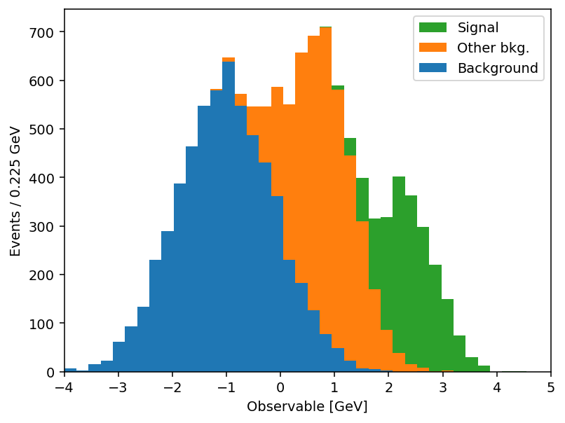
Same output, half the code. And the savings compound once you actually use the keyword arguments. mh.histplot accepts a NumPy tuple, a hist.Hist, a boost_histogram.Histogram, or any object implementing the PlottableProtocol, so the same call works regardless of what your analysis framework hands you. From there, the keywords most analyses lean on:
yerr=True→ Poisson intervals for integer counts; pass a 1D array for symmetric errors, a 2D(2, N)array for asymmetric ones, oryerr=Falseto suppress them entirely.w2=variances→ sum-of-weights-squared propagation for weighted MC. When combined withyerr=True, mplhep picks Poisson intervals for integer-likew2andsqrt(w2)otherwise;w2method=lets you force one or the other.sort="yield"→ auto-sort a stack by total yield (largest at the bottom);"label"sorts alphabetically; append_rto reverse.histtype=→"step","fill","errorbar","bar","barstep", or"band"(which spans theyerrrange — perfect for systematic uncertainty bands without a second call).density=True/binwnorm=1.0→ normalise to unit area or per unit bin width.flow="show"/"sum"/"hint"→ handle under- and overflow bins explicitly.blind=(lo, hi)(ormh.loc[lo:hi]) → hide bins in a signal region for blind analyses.
The full list is in the mh.histplot API reference. A short example that exercises several of these — sum-of-weights-squared on a weighted MC stack, auto-sorting by yield, a hatched MC uncertainty band, and Poisson-interval errors on the data overlay:
mh.histplot(
    mc_components,
    edges,
    w2=mc_variances,  # propagate Sumw2 for weighted MC
    stack=True,
    sort="yield",  # smallest yield on top of the stack
    histtype="fill",
    label=["Background", "Other bkg.", "Signal"],
)
mh.histplot(
    mc_total,
    edges,
    yerr=np.sqrt(mc_total_var),
    histtype="band",  # filled band spanning ±yerr
    label="MC stat. unc.",
    color="gray",
    alpha=0.4,
)
mh.histplot(
    data_counts,
    edges,
    yerr=True,  # Poisson intervals for integer counts
    histtype="errorbar",
    color="black",
    label="Data",
)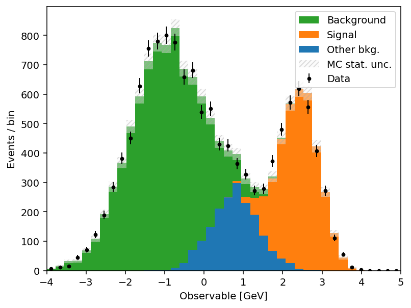
Stacks and comparison panels#
A HEP plot rarely stops at a single histogram. The canonical figure has a stacked background model, an unstacked signal or systematic-uncertainty band, data points with errors on top, and a thinner comparison panel underneath: a ratio, a pull, an efficiency. Those panels all share a layout — twinned bins, reference line at 1 or 0 — and they’re surprisingly tedious to assemble in matplotlib.
mh.comp.hists builds one in a single call for the two-histogram case; mh.comp.data_model handles the full data-versus-model figure with stacked and unstacked components, MC statistical uncertainty band, and any of the same comparison types in the lower panel:
Two histograms with a ratio panel
Data vs model with a pull panel
fig, ax_main, ax_comp = mh.comp.hists(
    h1,
    h2,
    xlabel="Discriminator",
    h1_label="Sample A",
    h2_label="Sample B",
    comparison="ratio",
)fig, ax_main, ax_comp = mh.comp.data_model(
data_hist=data,
stacked_components=[bkg_a, bkg_b],
stacked_labels=["Bkg 1", "Bkg 2"],
unstacked_components=[signal],
unstacked_labels=["Signal"],
comparison="pull",
)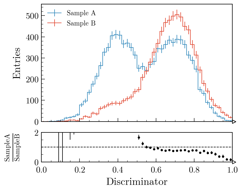
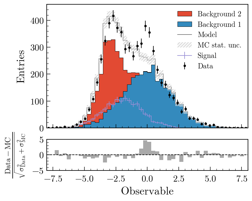
comparison= also accepts "difference", "relative_difference", "asymmetry" and "efficiency"; the MC statistical uncertainty is propagated through all of them. Swapping "pull" for "ratio" in the second example swaps the lower panel out with no other code changes. The comparisons guide covers every variant with worked examples; the gallery is the fastest way to find a plot that looks like the one you’re trying to make.
Experiment styles#
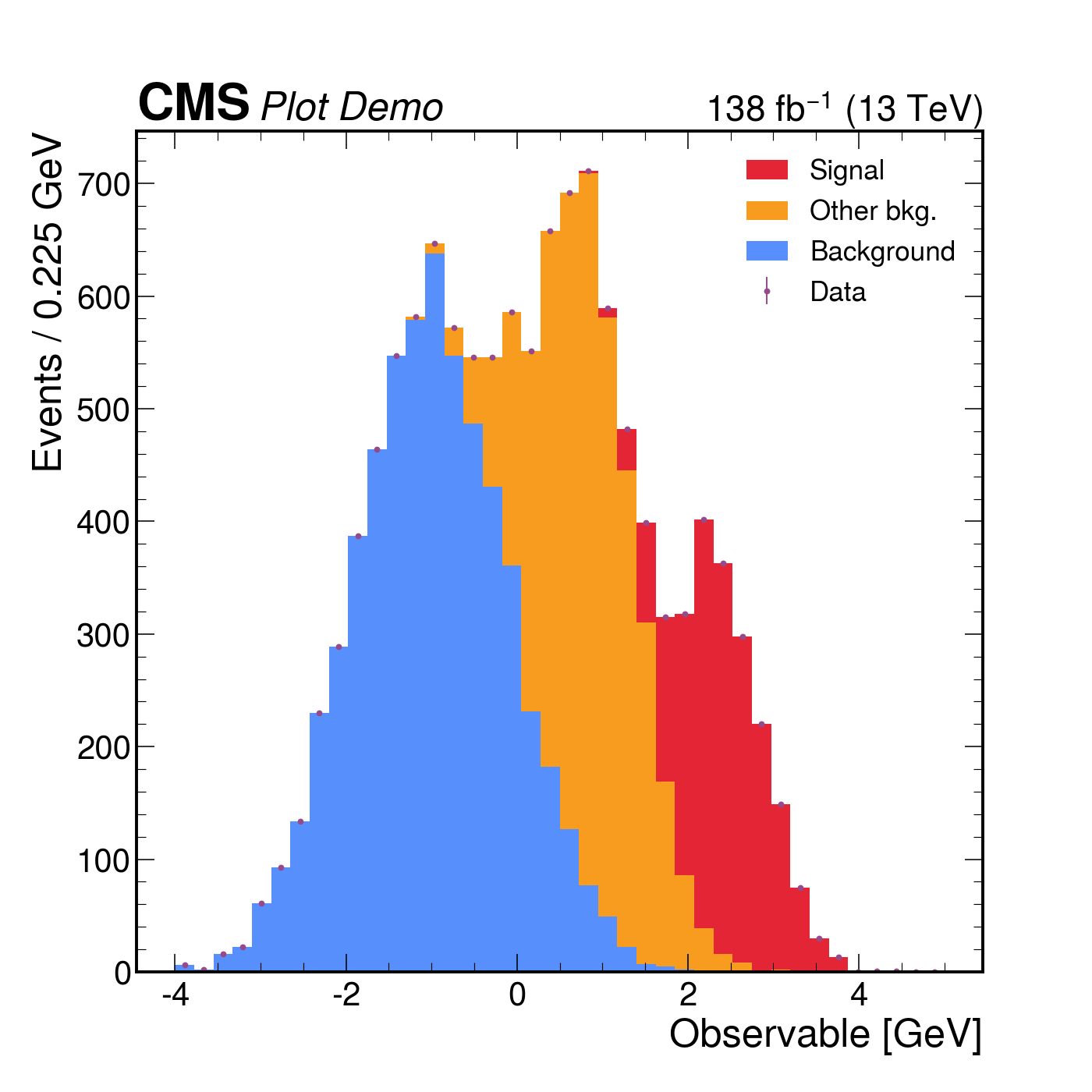
The third thing mplhep does is take care of the typography. Every collaboration has a house style — a font, a “CMS” / “ATLAS” / “LHCb” label with a status qualifier, a √s and integrated-luminosity string, specific tick directions and minor-tick behaviour, a colour cycle. mh.style.use("CMS") (or "ATLAS", "LHCb2", "ALICE", "DUNE") sets matplotlib’s rcParams accordingly and bundles the open fonts (TeX Gyre Heroes as a Helvetica stand-in, Fira Sans, etc.) so the result is reproducible across operating systems. The collaboration tag is placed by a matching helper — mh.cms.label, mh.atlas.label, mh.lhcb.label, mh.alice.label, mh.dune.label — which knows where each one is meant to live (CMS above the axes in the figure margin; ATLAS, LHCb and ALICE inside the axes at top-left). For figures heading somewhere that doesn’t fit a single collaboration’s house style, mh.style.use("plothist") provides a neutral serif look with the same comparison-panel ergonomics and no experiment tag. The styling guide catalogues every available style and the exact arguments each .label() helper accepts.
with plt.style.context(mh.style.CMS):
    fig, ax = plt.subplots()
    mh.histplot(
        [ha, hb, hc],
        edges,
        stack=True,
        histtype="fill",
        label=["Background", "Other bkg.", "Signal"],
        ax=ax,
    )
    mh.histplot(
        ha + hb + hc, edges, histtype="errorbar", color="black", label="Data", ax=ax
    )
    mh.cms.label("Plot Demo", data=True, lumi=138, com=13, ax=ax)
    mh.mpl_magic(ax=ax)
The same three-component stack with data points rendered four ways. Each style picks its own colour cycle, font, and label conventions; mh.mpl_magic auto-grows the y-axis so the experiment tag, legend and data don’t fight for the same space, and is one of a small set of layout helpers (yscale_legend, yscale_anchored_text, sort_legend, append_axes, …) that the utilities guide covers in full.
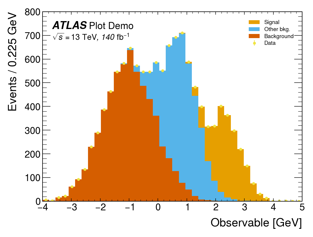
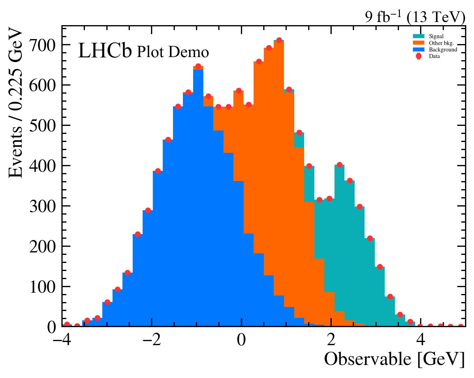
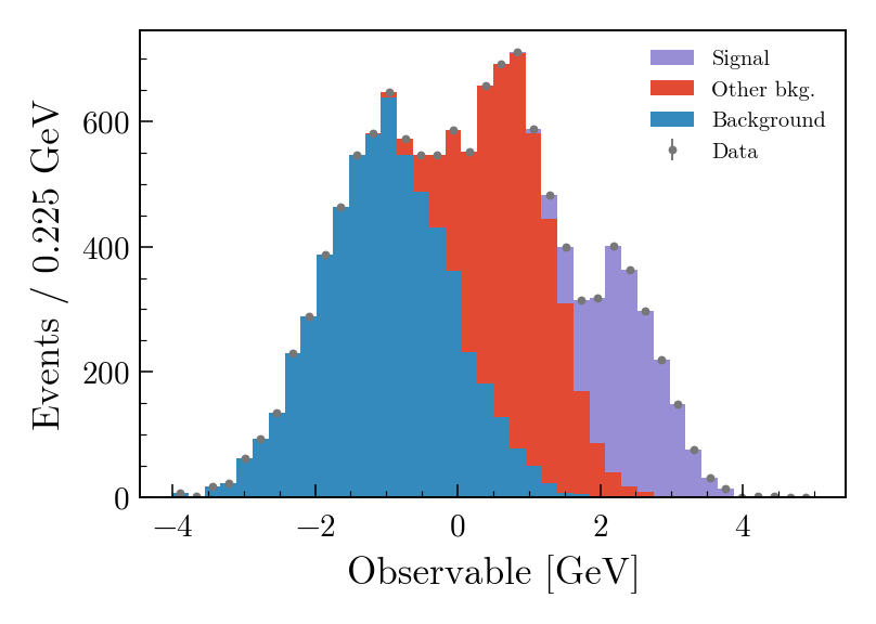
The same data, the same single mh.histplot call — only the active style context changes.
Where it fits#
mplhep is part of Scikit-HEP, a collection of pure-Python tools for particle physics that also includes hist, Uproot, Awkward Array, vector and pyhf, among many others. It deliberately stays a thin layer on top of plain matplotlib rather than replacing it — every figure mplhep produces is a regular Figure/Axes pair you can keep customising with the matplotlib API you already know. The point is to remove the friction of the conventions, not the flexibility underneath them.
If you work in HEP, pip install mplhep followed by mh.style.use(...) should be the first two lines of any plotting notebook. If you don’t, mh.histplot for pre-binned data and the comparison-panel machinery are still useful well outside the field — anywhere “two histograms and their ratio” is the natural unit of a figure.
- Docs: scikit-hep.org/mplhep — start with the basic plotting, comparisons, styling and utilities guides, browse the gallery for inspiration, or jump to the full API reference.
- Source: github.com/scikit-hep/mplhep
- Discussion: github.com/scikit-hep/mplhep/discussions