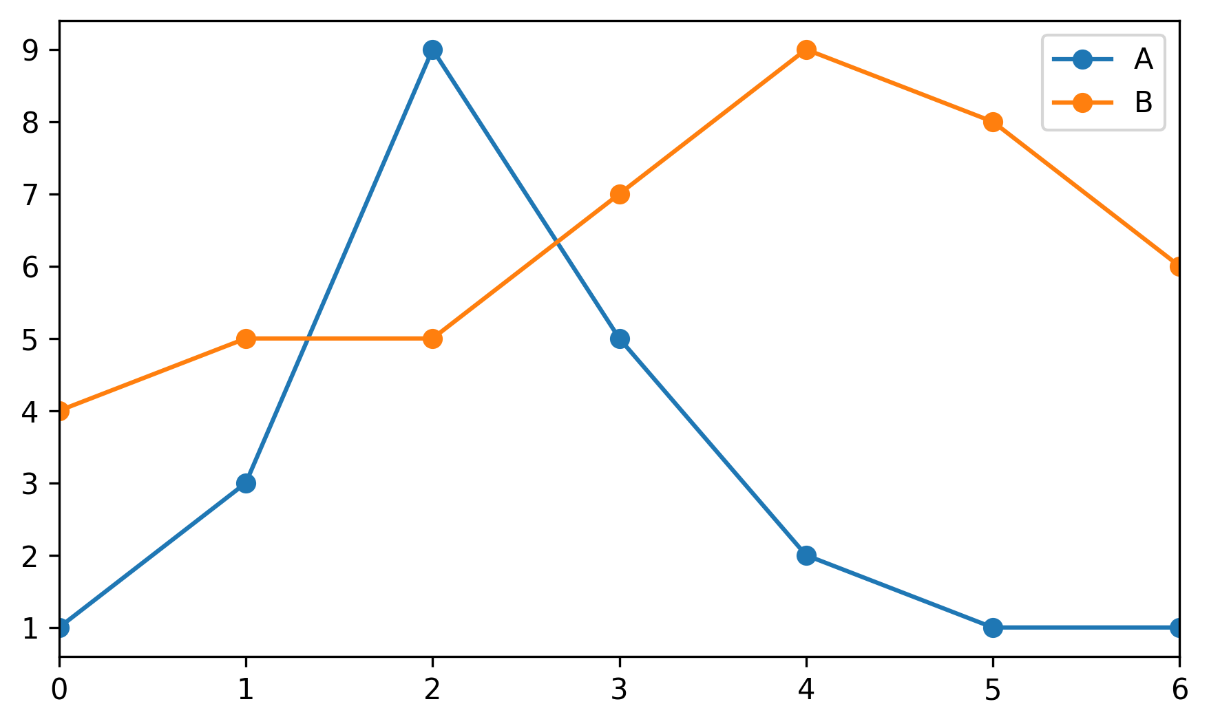
1 - The Basis#
Let’s make up some numbers, put them in a Pandas dataframe and plot them:
import pandas as pd
import matplotlib.pyplot as plt

df = pd.DataFrame({'A': [1, 3, 9, 5, 2, 1, 1],
                   'B': [4, 5, 5, 7, 9, 8, 6]})

df.plot(marker='o')
plt.show()
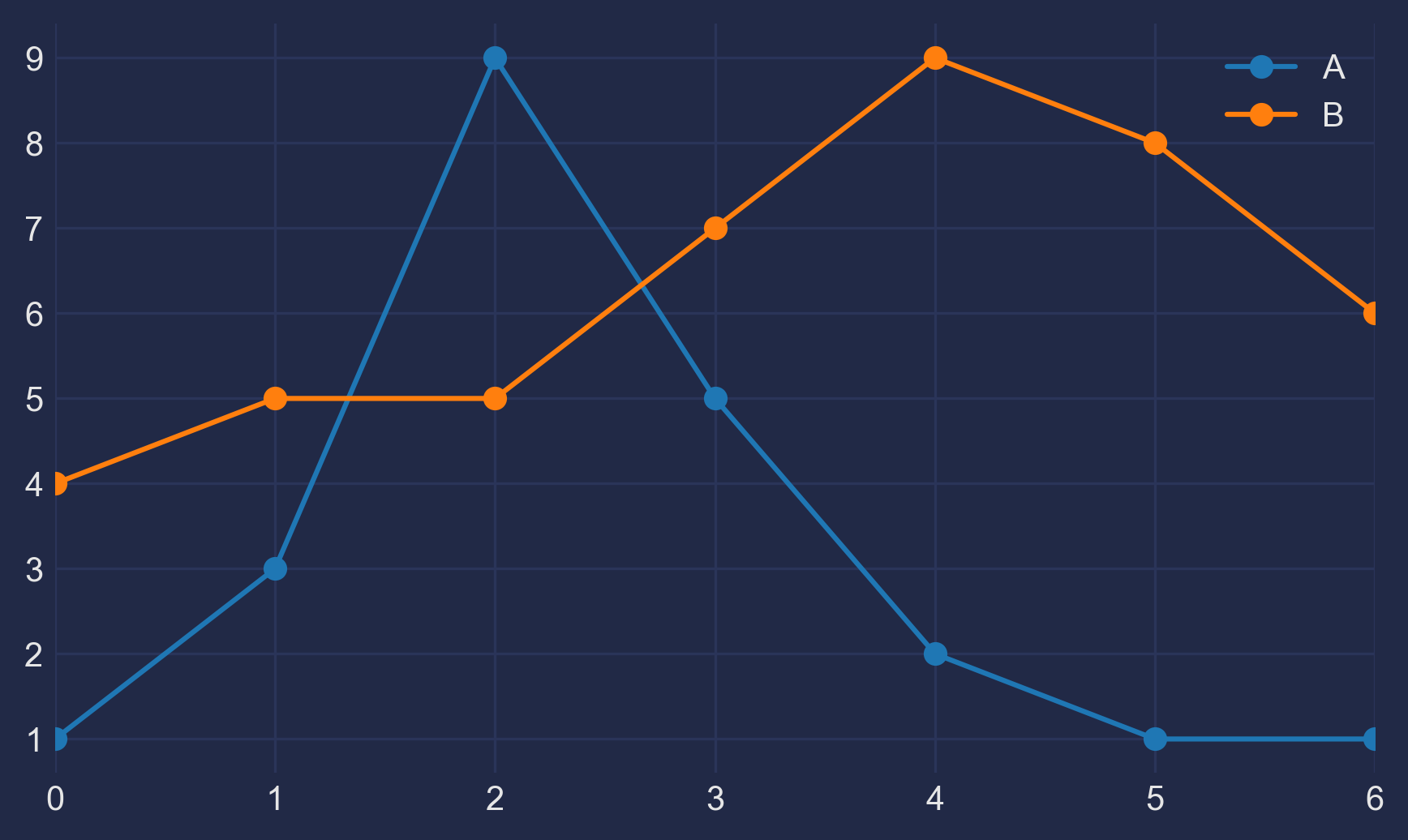
2 - The Darkness#
Not bad, but somewhat ordinary. Let’s customize it by using Seaborn’s dark style, as well as changing background and font colors:
plt.style.use("seaborn-dark")

for param in ['figure.facecolor', 'axes.facecolor', 'savefig.facecolor']:
    plt.rcParams[param] = '#212946'  # bluish dark grey

for param in ['text.color', 'axes.labelcolor', 'xtick.color', 'ytick.color']:
    plt.rcParams[param] = '0.9'  # very light grey

ax.grid(color='#2A3459')  # bluish dark grey, but slightly lighter than background
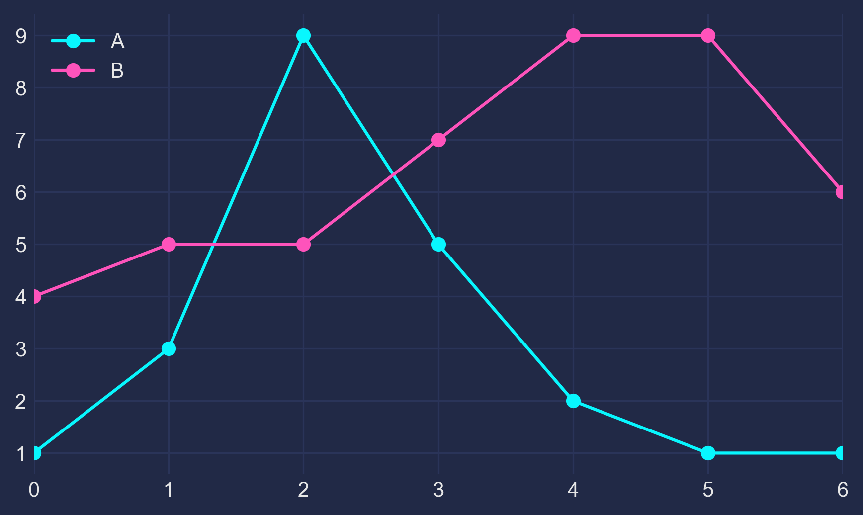
3 - The Light#
It looks more interesting now, but we need our colors to shine more against the dark background:
fig, ax = plt.subplots()
colors = [
    '#08F7FE',  # teal/cyan
    '#FE53BB',  # pink
    '#F5D300',  # yellow
    '#00ff41', # matrix green
]
df.plot(marker='o', ax=ax, color=colors)
4 - The Glow#
Now, how to get that neon look? To make it shine, we redraw the lines multiple times, with low alpha value and slightly increasing linewidth. The overlap creates the glow effect.
n_lines = 10
diff_linewidth = 1.05
alpha_value = 0.03

for n in range(1, n_lines+1):

    df.plot(marker='o',
            linewidth=2+(diff_linewidth*n),
            alpha=alpha_value,
            legend=False,
            ax=ax,
            color=colors)

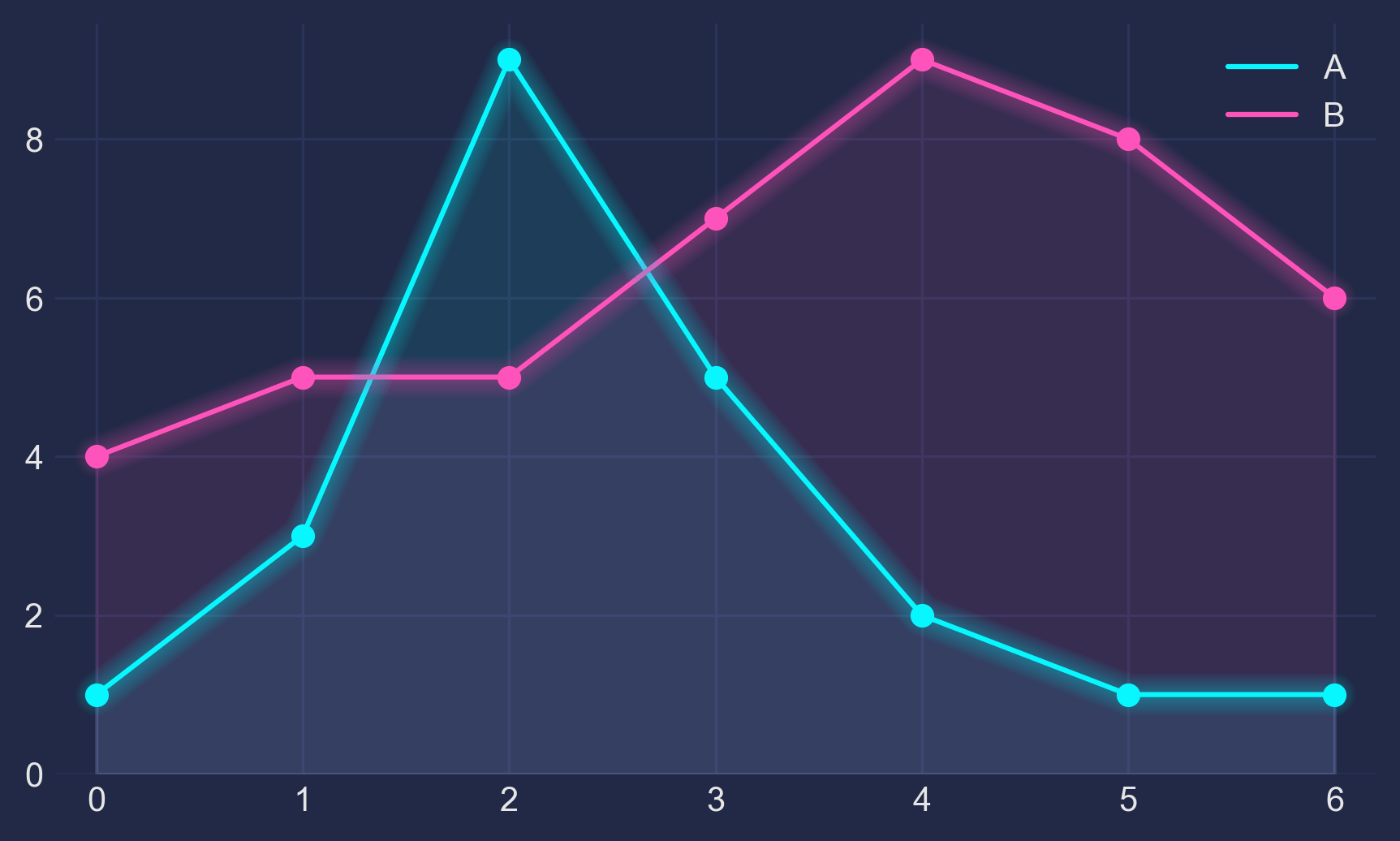
5 - The Finish#
For some more fine tuning, we color the area below the line (via ax.fill_between) and adjust the axis limits.
Here’s the full code:
import pandas as pd
import matplotlib.pyplot as plt


plt.style.use("dark_background")

for param in ['text.color', 'axes.labelcolor', 'xtick.color', 'ytick.color']:
    plt.rcParams[param] = '0.9'  # very light grey

for param in ['figure.facecolor', 'axes.facecolor', 'savefig.facecolor']:
    plt.rcParams[param] = '#212946'  # bluish dark grey

colors = [
    '#08F7FE',  # teal/cyan
    '#FE53BB',  # pink
    '#F5D300',  # yellow
    '#00ff41',  # matrix green
]


df = pd.DataFrame({'A': [1, 3, 9, 5, 2, 1, 1],
                   'B': [4, 5, 5, 7, 9, 8, 6]})

fig, ax = plt.subplots()

df.plot(marker='o', color=colors, ax=ax)

# Redraw the data with low alpha and slightly increased linewidth:
n_shades = 10
diff_linewidth = 1.05
alpha_value = 0.3 / n_shades

for n in range(1, n_shades+1):

    df.plot(marker='o',
            linewidth=2+(diff_linewidth*n),
            alpha=alpha_value,
            legend=False,
            ax=ax,
            color=colors)

# Color the areas below the lines:
for column, color in zip(df, colors):
    ax.fill_between(x=df.index,
                    y1=df[column].values,
                    y2=[0] * len(df),
                    color=color,
                    alpha=0.1)

ax.grid(color='#2A3459')

ax.set_xlim([ax.get_xlim()[0] - 0.2, ax.get_xlim()[1] + 0.2])  # to not have the markers cut off
ax.set_ylim(0)

plt.show()
If this helps you or if you have constructive criticism, I’d be happy to hear about it! Please contact me via here or here. Thanks!